The Client
E-commerce web redesign
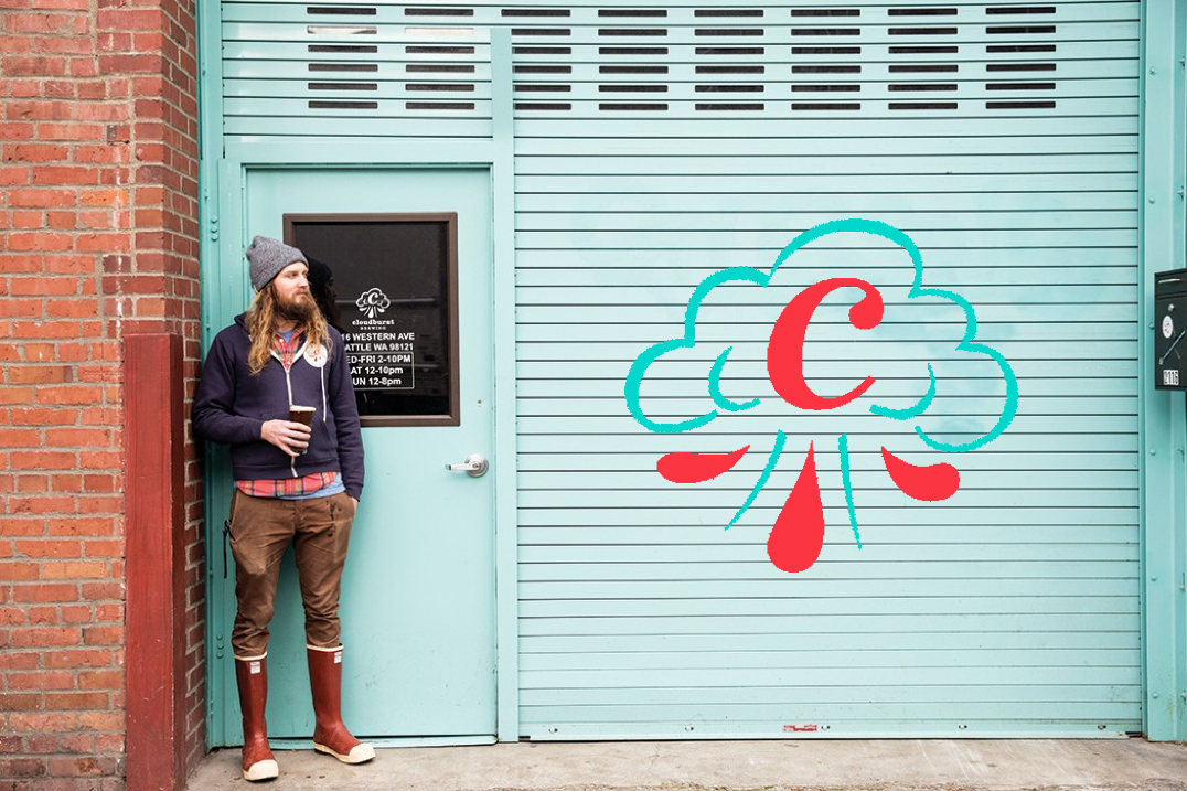
Cloudburst brewery is a micro brewery located in the heart of downtown Seattle. Cloudburst Brewery’s has earned quite the name for its self because of its founder Steve Luke ( who has also created Space dust formerly at Elysian Brewery).
The Challenge
““My finger is sure getting tired from scrolling...””
Single scrolling web application
Cloudburst Brewery is a single scrolling web based application that allows users to view rotating beers on tap. Because its current UI is lacking an E-commerce system, there were also many elements on the existing web app that causes cognitive load because of the amount of old information on the page which causes users to lose interest trying to complete their task.
Goal: Easy navigation
I believe that creating a design that is both beautiful and easy to navigate, will capture the users in a way where it will be easier for them to accomplish their goal.
User interview
We don’t have this beer where were from”
During my visit to my client, I spoke to an out of town couple visiting the brewery from Austin, Texas. During our interview, they had mentioned they had stumbled across the brewery from a famous YouTuber and wanted to try it out for them selves. I mentioned to the couple how they would feel about incorporating an E-commerce system and loved the idea. Back in Austin, they had mentioned the brewery scene isn’t as popular and also having limited access to craft beers.
With owner
During my visit to Cloudburst Brewery, I was not able to talk to the owner because of the amount of traffic in the brewery, but I did manage to get a business card. After receiving an email from the operations manager, I raised the question about what they think about their current website and also their thoughts on an E-commerce sections. Although stated to have kept the website up to date because of the interesting beer names, the single scroller web pages with the beer names consisted to be an issue, so I knew there was potential for a redesign.
Persona
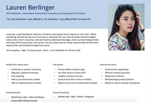
Lauren Berlinger, 29 year old
After conducting various research methods for the first half of my redesign, I was given this persona by my client; Lauren Berlinger. Lauren Berlinger is a 29 year old Scriptwriter who loves exclusive retro products.
Pain points Lauren has:
Lengthy check out process
Making it simple
Serving Lauren:
Reducing cognitive load by eliminating unnecessary information
Ability to order products online
User Flow
Lauren’s journey through Cloudburst experience.
Lauren’s journey starts off with what does she want to buy, searching for what she wants, adding it to cart, account login/ account creating, payment followed with purchase complete.
SITE MAP
Overall structure of website
Based on the user need, business need and research, i created a site map of my redesign to get a better idea of the visual hierarchy.
Moodboard
Gaining inspiration
Part of my design process is creating a mood board of different elements that represent the brand. Pulling elements such as color pallets, brand inspiration, textures, competitors, as well as elements needed for the scope of Lauren’s needs.
Usability Testing
“Felt very mobile compared to web design”
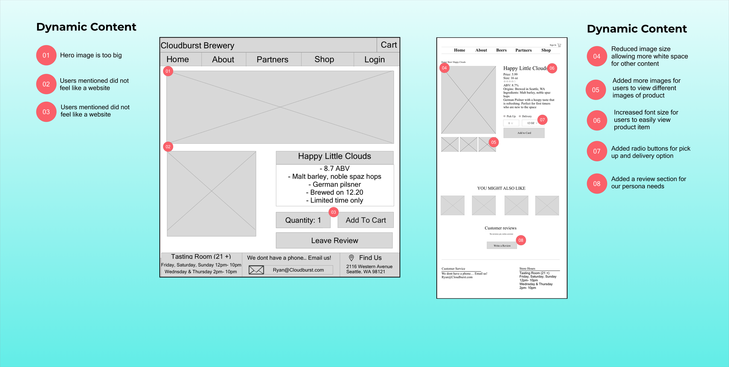
Once I completed my wireframes, I created a prototype of my website redesign to begin usability testing. This would allow me to measure how users would engage with the proposed website solution and validate with Lauren as my user. It was important to test with low- mid fidelity wireframes to gather the most honest, critical feedback from users to solidify my redesign.
During my usability testing, I conducted 2 rounds of usability test with 3 participants each and asked them to complete scenarios to put them selves in Lauren’s shoes.
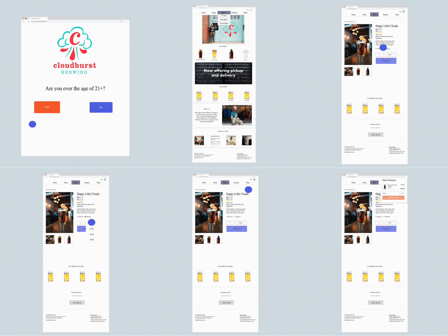
Mockup
Takeaways
Improve moving forward
Create a product rating user flow
More Iterations/ more usability testing for more feedback
Explore color combinations
What we did well
Free-styling a design is a-lot tougher, when you are not using inspiration
Make art-boards longer to simulate users can scroll down page
Taking more screen shots of iterations for my case study


