The Client
In 2003, Cupcake Royale became the first cupcake cafe outside of New York City to open up shop, in the Seattle, Washington. Home to the Pacific Northwest, Cupcake Royale is a community focused cupcake shop that only focus's on its local produce and organic ingredients. As a part of the General Assembly team, our team had 2 weeks to use UX methodologies to find any faults and implement iterations using research and design. My job as the Interaction Designer, I worked very close with the our User Researcher and Project manager to create a more functional and design to meet the business needs and persona needs.
The Challenge
“How can we enhance the native
IOS experience?”
Kicking off our project, we initially started our on an Android approach, because when putting Cupcake Royale's app side by side, most of the Android functionalities, did not work. Going back to our research, we found out that most of our users used the app on an IOS device, thus putting our design in the direction.
Key Issues we got back for our researcher, were that a lot of the users that currently use the app, use it for paying, but one thing they mentioned they would like was the ability to pick up ahead of time with out calling. Using the app on the IOS device, we found out that features on the app are not all native. Navigating to the menu section, we found the function incomplete because when clicking menu, it opened Cupcake Royale using the Safari browser.
Our solution, to solve our clients issues current issues, are to conduct research on our user base, and create a design that both better for the UX, and also finishing the menu flow to make it more native
Competitive analysis
Trends: Credit card flow, native application presence, e-commerce/ rewards section
During the time our researcher was collecting and synthesizing our research data, one thing i also did as an Interaction designer was conducting a competitive and comparative analysis. I conducted a competitive analysis on local competitors to see what our client was up against, but noticed that a lot of our competitors do not use a mobile app.
When conducting my comparative analysis, i compared companies that had an E-commerce and rewards systems presence. One thing i found very interesting when conducting this analysis was that a-lot of the companies had credit card payments at the end of the checkout process.
This was something very helpful for us as a team because a-lot of users using the current app had mentioned they do not like having to add their credit card before navigating through the app.
Sitemap
Overall Structure
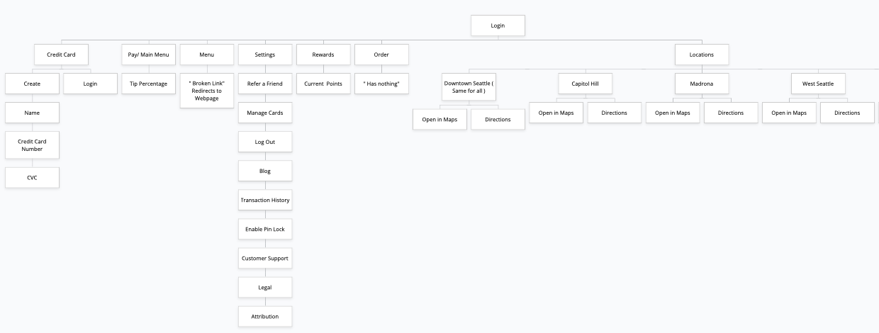
After conducting my interview’s with both users and owner, I created a site map to define the overall structure of the website. This was to ensure that products were going to be placed where users would expect to find them when using the app to make the experience more intuitive.
Current UI
On the current app, a lot of users mentioned how they would like to view the menu, before signing up for the app. This was a key issue during our research findings because a lot of our users felt like they were forced to sign up for the app before doing anything. This made our users feel like they wanted to back out, and said they lose interest using the application because of this.
Persona
Linda Davidson, 26 Year Old
After our researcher has conducted a variety of research methods, we came up to the idea of the persona Linda Davidson. Linda Davidson is a graphic designer, who is always on the go who loves ordering ahead.
Pain points Linda has:
Complicated layouts uncertain categories and navigation
Browser like experiences in mobile
Serving Linda:
Valuing her time, by creating the option for her to pick up ahead of time
Creating an app that is beautiful and simple to use
Offering a rewards program
Moodboard
Inspiration
To gain inspiration, i created a mood board of different elements to help kick start my sketches incorporating elements such as color pallet, typography, textures, IOS designs, and also Apple’s human interface guidelines (HIGS)
Sketches
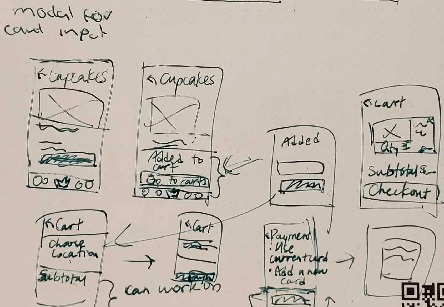
After collaborating with our researcher and having our persona set in stone, it was time to start sketching. During the sketching phase, I sketched various different types of screens such as rewards, E-commerce check out, menu and login. Keeping our persona Linda in mind, Linda is a busy individual who needs to be able to accomplish tasks on the go, so basing my design and sketches around her needs were crucial.
Wireframe
Iterations
3 rounds of iterations, 3 rounds of usability testing
During the iteration phase, my team and i were able to conduct 3 rounds of usability testing with 3 users each. During each round of usability testing, our users found many faults.
Final Design
Takeaways
Improve moving forward
More time understanding deliverables before project kick off
Understanding each others strengths and weaknesses
What we did well
Native mobile application
Synthesizing data in to design


