The Client(s)
Say goodbye to dead zones
Vilo Living is a mesh router solution designed to provide reliable coverage for Internet service providers and consumers. Our goal is to eliminate dead zones in customers' homes and improve overall coverage. In this case study, we will examine the integration of Vilo Living with Bark. The challenge was to effectively incorporate these two brands in a cohesive and concise manner. The results of this integration will be discussed in order to provide insight into the benefits and effectiveness of this solution.
Award winning parental controls
Bark is a parental control software that helps parents keep their children safe online by monitoring their online activity and setting limits on their internet usage. It uses artificial intelligence and machine learning to identify potential risks and alerts parents about them. Bark also allows parents to block certain websites and apps and set up custom notifications. Its goal is to help parents keep their children safe online while still allowing them to use technology and the internet in a responsible way.
The Challenge
“How can we create a beautiful and functional landing page that brings awareness to Bark Home and Vilo Integration?”
During the project kick-off phase, the team consisting of the CEO, Marketing Manager, Social Media Specialist, worked closely together to fully understand the project deliverables and determine the necessary steps for successful deployment. This collaboration allowed for a clear understanding of the requirements and goals for the product launch.
Goal
〰️
Goal 〰️
Effortlessly integrate Bark Home and Vilo for a cohesive brand experience
The landing page should clearly communicate the value of using Bark and Vilo Integration together and should be targeted at parents and guardians who are looking for a way to monitor and manage their children's online activity.
Research & Planning
Competitive analysis and market research
During the research phase, i conducted competitive analysis on our competitors on how their landing pages looked like. Pulling inspiration and staying up to date with with the market, this was a big help for us
While conducting market research, i researched our integration platform bark to understand exactly what we needed to implement. Working along side the product manager, and marketing manager i had to become the subject matter expert to fully submerge myself in the product.
Levels of service
Bark comes in 3 layers. Bark Home, Bark Junior, and Bark premium the higher in Bark you pay, the more security you get. Bark Home is what Vilo integrated, offering a $79 for free for users who own Vilo.
Brand integration
Merging two brands can be a bit of a challenge, especially when they have different color palettes like Vilo and Bark did. I tried out a few different color combinations, like using the vivid blue and amber orange from Vilo, but I found that these colors were a bit too harsh on the eyes. So, I decided to go with amber orange as the primary color and ALT blue as the secondary color for Bark. This ended up working out really well, especially since Vilo was the main entity being integrated. It felt more fitting to use their primary color as the main branding. Overall, the new brand has been well-received by customers.
Media Kit
During this project, we were also given a media kit to help bring Bark’s brand to full circle. Which included images, logos, how to use logo.
Wireframe
Pulling inspiration from previous project
During the Prototype and testing phase, the team. and I conducted 4 rounds of iterations. Starting with a low-fi to really get our ideas out, I worked closely with the Marketing manager to see what datapoints we wanted to pull from Bark. One thing we did do was pulling references from the Bark integration from the mobile app project since these two projects were parallell to each other.
Iteration
Too much Vilo, not enough Bark
Referencing Barks mobile project, we used a simmilar design across to the web to incompase brand identity. Parts of Barks mobile we used for desk top were the hero image, and the list of services Bark Home offered.
Iteration 2
Iteration 3
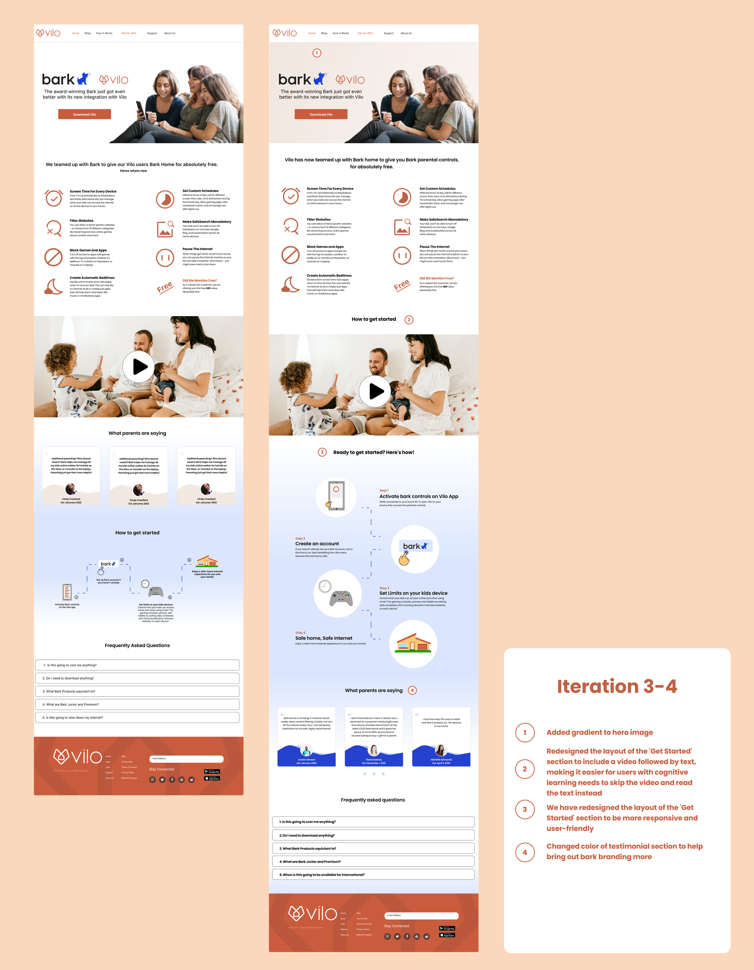
Leveraging how to get started with video and text for users with different types of cognitive learning
Big takeaways from this iteration were the use of Bark, incorporating more of its brand color to help signify the integration. Another thing that was a big key component for us was laying out Vilos landing page in a way where users with different types of cognitive learning would be able to digest it more clear.
Final design
Measuring success
Through various types of marketing, (social, email, video, etc) we were able to measure our websites performance and found that out of 150/ 457 users, ( both ISP and general users) we found that:
Website analytics
Page views: 69
Average Session Duration: 38 seconds
Session: 50
Bounce Rate: 40%
Average time spent: 27 seconds
Conversion: 5
Website can be found here :)
Takeaways
Challenges:
Defining brand guideline typography for entire Vilo desktop and mobile web experience
Understanding the differences between Barks features and how its going to integrate with Vilo
What we did well
Incorporating the two brands and an elegrant and easy digestable way
Executing design within 2 week sprint
Freestyling design


