The Client
Community health providing care for under-privilege members of our community 👨⚕️👩⚕️
HealthPoint is a community-based, community-supported, and community-governed network of non-profit health centers dedicated to providing expert, high-quality care to all who need it, regardless of circumstances.
HealthPoint’s mission is to strengthen communities and improve people’s health by delivering quality health care services, breaking down barriers, and providing access to all.
Business goals
“How can we redesign our self service portal for members of our community to make an appointment with us online?”
Redesigning the self service portal that is functional and beautiful that allows users within our community to schedule an in person and telehealth visit 👨⚕️
During project kick off, I collaborated with project owner Cassy. She came to me because they had an idea of having our users not only be able to schedule a COVID-19 appointment, but also in person and or telehealth visits as well. During our discovery meeting, deliverables we agreed upon were:
Key takeaways
Incorporating a new self service flow
Catering to our users ( ages 45-75)
Improving the overall UI to make design more modern
Demographics
Who exactly are we designing for?
During our discovery meeting, we also touched on the demographics of our user base based of the year 2021. Our user base for our client range from 18- 75 years old. At 33% of our users being 18- 45. While 67% being from ages 45 - 75. This gave me a great idea of where I wanted the design to go based on our user base and from there I conducted further research.
American Optometric Association (AOA)
With the age range of our users given by our project owner, I conducted further research on challenges our target demographics faced and found this article posed by the American Optometric Association (AOA) and found that adult vision from 41 years old to 60 years begin to deteriorate.
With symptoms such as :
Changes in color perception
Difficulty reading and doing close work
Need for more light
Current UI
Not very responsive 📱
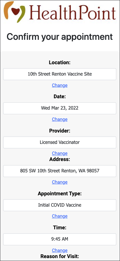
While keeping our goal in mind about creating new self service flow, I noticed a lot of things that could be improved in the current UI. When testing myself to get the full end to end experience, I noticed the current UI felt as if it was not responsive, type faces were different styles, and also missing alignment and spacing and consistently.
User flow
Task at hand 📲
Focusing on the task at hand and the way we want our users to interact with our product, I created a user to get a better visual representation of how we were creating the task at hand. Our main user flow we went with is a users journey to schedule a visit online that is closest to their home.
Accessibility Design
Designing for users who have decreasing visual deficiency
Referencing to Web accessibility color guidelines ( WCAG AA and AAA) I focused on the users with permanent and decreasing visual deficiency (40 years +), specifically targeting users that are elderly/ aging and found that users within this specific demographic have reduced contrast sensitive, color perception and near focus making it difficult to read things which is also known as presbyopia. And also discovering users that users within this same group, have cognitive deficiency, such as short term memory, difficulty contracting and easily distracted.
Brand Guidelines
Brand Guidelines 🔖
Following brand toolkit, we wanted to keep our design consistent with the Health point’s brand itself. One thing I noticed about the brand tool kit was they did not have a mobile web section. With given that, it gave me more room to push the creative boundaries. One thing they did mention when designing for web, was to use roboto font. I continued to use roboto font just to make things consistent throughout Health point’s web experience.
Another thing that I was told after my discovery meeting when I was researching the brand, I was told I could use the main web page for inspiration since this design is more current and up to date.
persona
VINCENT LENG, 64 YEAR OLD
After collaborating with project manager, Vincent was given to create our human centric design around. Vincent Leng is a married grandfather with 2 grown kids. Vicent routinely goes to the Healthpoint for his routinely blood work.
Painpoints Vincent has:
Being able to schedule an appointment without asking for help
Hard for him to see/ use technology
Not being able to schedule a regular appointment
Serving Vincent:
Redesigning the UI so it is simple and easy to use
Incorporating web content accessibility guidelines (WCAG)
Creating a self service flow
Wireframe
Simple and brand centric
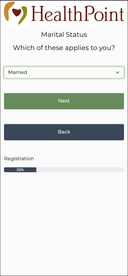
Presenting the first wireframes, I created a mid fidelity wireframe just so our stakeholders would be able to visually see the idea. Circling back to our goal at hand; being able to create a self service flow I had to make sure the main screens were there.
Iteration
Beefing up the current design 🐄
During our feed back session, I had other members of the project step in to give some feed back. Key takeaway they mentioned during our session was adding the week days to the to help our users confirm the days of the week, adding an notification section, and also validating the contract colors of the design throughout all the design.
Final Design
Final design executions
Following WCAG AA+ AAA
Validating design with contrast checker tool
Increasing font sizes from 14 px to 16 for accessibility
And also learning that Roboto font is a great san serif accessibility typeface
Takeaways
Improve moving forward
Gather user insights to gain better understanding of success metrics on how design worked with user demographic
User testing with target audience
Collaborating with Nextgen engineers team for back end patient information
Educating myself further in accessibility design
Incorporating accessibility in the beginning of the design process
What we did well
Accessibility certified click here to view achievement
Incorporating brand identity
Incorporating Web content accessibility guidelines (WCAG) standards


